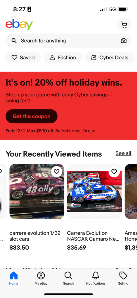
The eBay website design is simpler and I’m all good with that. It’s clean and not cluttered like a lot of other sites out there.
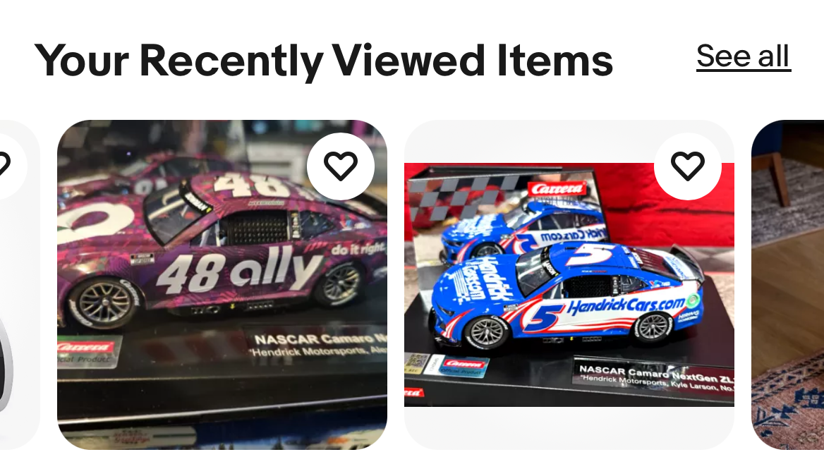
They kept the focus on the user. Still allowing for them to look for products easier. Great job of making the imagery stand out on the home page.
Ninety percent of the time I’m using the mobile app. As long as the changes there match the website I don’t have any complaints. I need the functionality to be the same whether I’m on my computer or phone.
The most crucial thing; which eBay does very well in their web design is speed. I never have trouble loading pages or purchasing products. Whatever their infrastructure setup is it’s phenomenal.
